Foodpath
Improving the experience of eating out.
Concept for a geolocation-based restaurant app designed to provide users with honest, reliable and relatable restaurant recommendations.
Concept for a geolocation-based restaurant app designed to provide users with honest, reliable and relatable restaurant recommendations.

Application that connects good food & people
— easily get to a restaurant, get recommendations for any cuisine, and keep track of the places you love to eat.
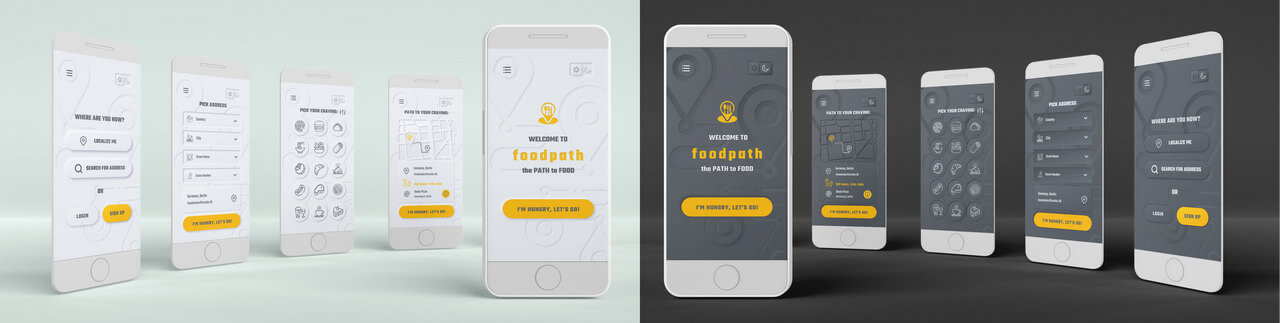

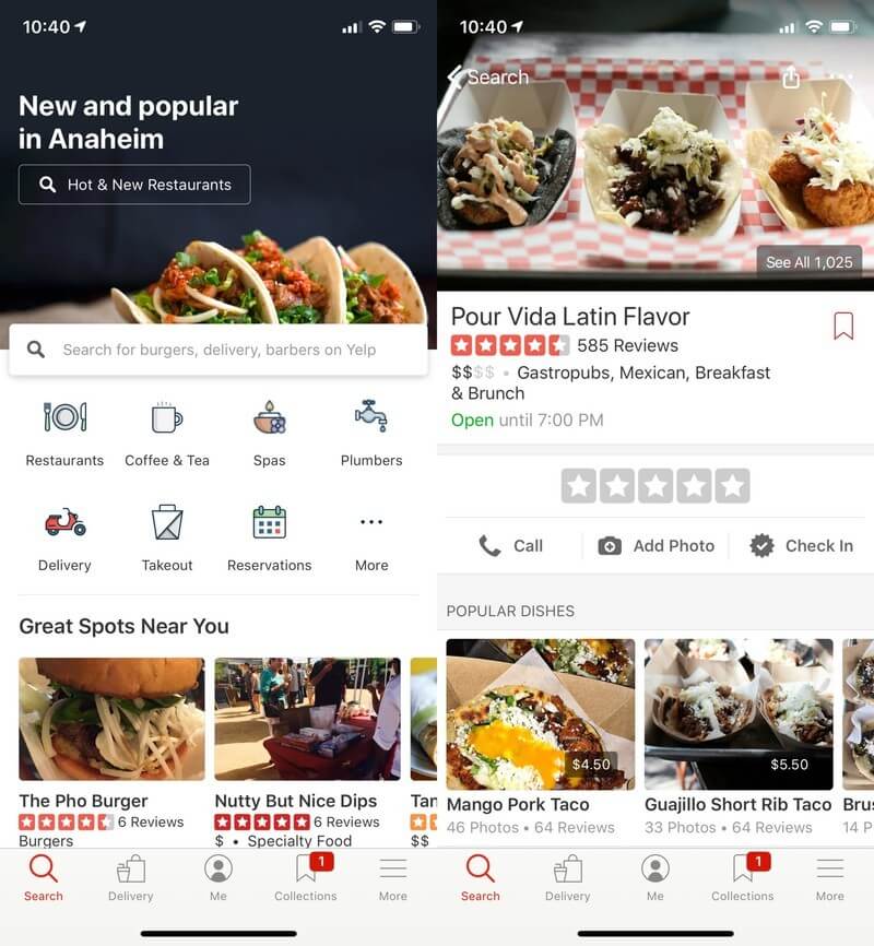
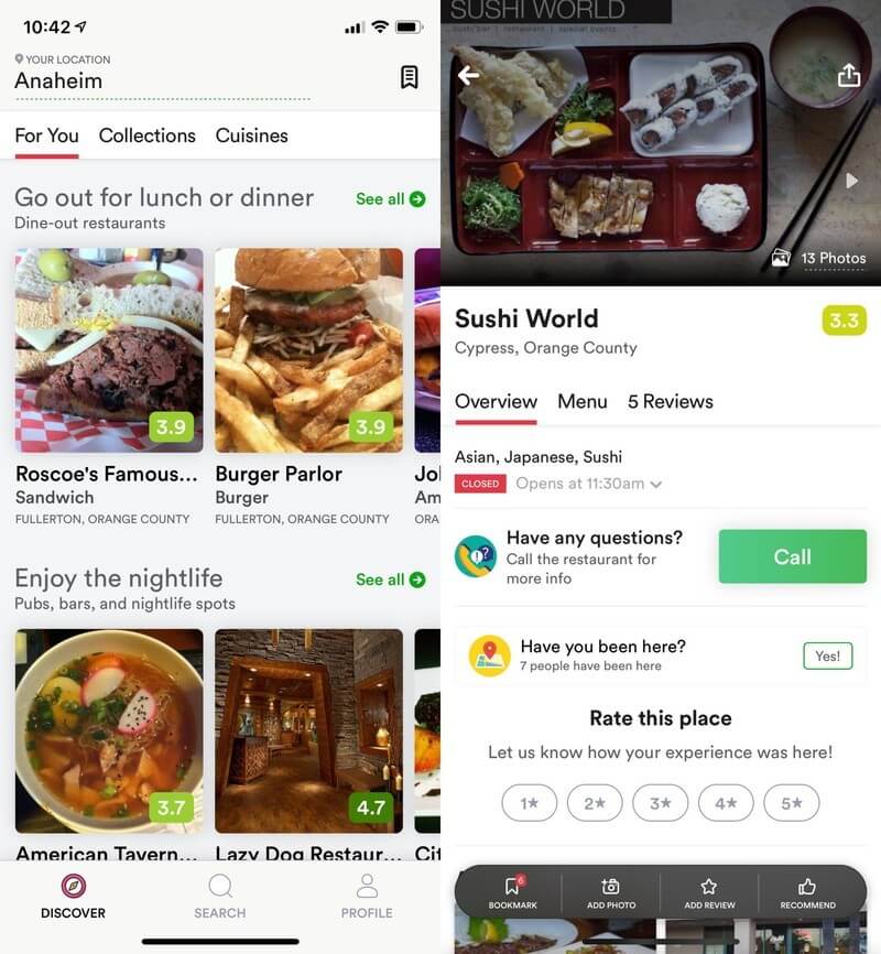
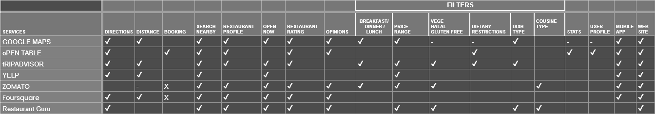
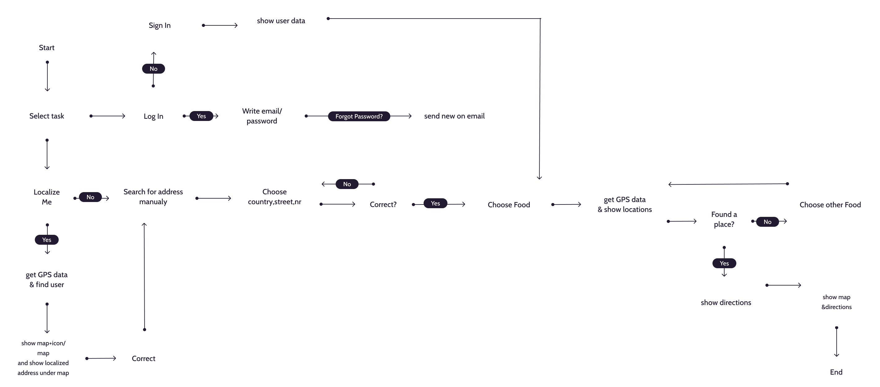
Search by location - geolocation-based search provides the option to find the nearest restaurants and create the shortest route to the chosen place.

The app shows the distance and direction to the restaurant.
Google maps shows the road to the chosen destination.

Filtering on the basis of food, type, budget, diet restrictions, distance - filters help to narrow down the search.

User creates a profile by manualy setting the email address and password, or can log in/ sign up by Google or Facebook account

List of available restaurants based on the food search & filters with restaurant profile information: type of food, menu, phone contact, opening hours, ratings

Top corner app hamburger menu lets the user access all important main features and know-how information.

Research

Wireframe

User flow

Design

Prototype

Coding

User testing
Google sheets

Photoshop

Illustrator
Figma

Sublime text
Maze
Foodpath is a name based on the idea of a footpath - a path for people to walk along. App's name results from the combination of “food” & “path”. Designed to provide users with reliable and relatable restaurant recommendations. This is my passion project. Started to solve my problem, although I did web & user research to check if this is a more common problem for people.
The problems I had:
I'm at a friend's place, we need to order food, it's late, most of the restaurants are closing, but we don't know the neighborhood.
I'm on a short work trip, in a big city, with many food places; I don't know where I can go, within the walking distance of 5-10 minutes to eat good food now.
I'm on a weekend private trip: I came for a conference and booked a private apartment, so the fridge is empty and I really need to eat breakfast before I'll go to the event.
I have a craving for a very specific food, like pancakes & I don't want to look through all the menus to be sure that chosen restaurant has it.
I am in the city, hungry, and would like to eat something tasty, I want to be sure I picked the best restaurant for it.
Learning about user, market & competition
As my first approach, I created a google form with few questionnaires.
The purpose of this questionnaire is to identify their preferred method of finding a nearby restaurant.
150 responses were asked via Google form for data analysis.
More than half of the respondents were males (55%).
Respondents were in the age range of 21 to 49 years old.
Problems while looking for restaurant:
I mapped out the users’ steps to see how I could simplify their journey to help them reach their most important goals with the product.
| AWARE | SEARCH | ACOMODATION | ON WAY | IN RESTAURANT | |
|---|---|---|---|---|---|
| USER GOAL | Find restaurant quick | Find good restaurant | Find restaurant with good food | Get there quickly | Get good food |
| EMOTIONS | Uncertain | Concerned | Decisive | Hungry | Satisfied |
| PROBLEMS | To many options | Hard to find something interesting | Fear of finding something good, not sacrificing taste for price | Fear of finding the fast route to the place | Slow service |
| IDEAS | Personalized recommendations based on filter choices/ past visits | Introducing recommended options, updated frequently | Useing filter for more narrow choice | Map showing the journey with direct path and journey time | Menu list and in-app call to contact and preorder food |


The goal of these wireframes was to test the user flow and to identify any potential roadblocks or challenges in the user experience.
By iterating the design multiple times, the goal was to arrive at the optimal solution that provides a seamless experience for the users.
The wireframes also helped in visualizing the design, which helped in refining it further before moving into the prototyping phase.
Smooth, intuitive and clutter-free user interface.
I used this style because I wanted clean/ quick to load app without overstimulation, easy to navigate.
Visual style is minimal with light graphics & no images.
Light/dark mode
WCAG finger print target size elements
I followed iOS Styleguide:
Helps people focus on primary tasks and content by limiting the number of onscreen controls while making secondary details and actions discoverable with minimal interaction
Adapts seamlessly to appearance changes — Dark Mode — letting people choose the configurations that work best for them.
Enables interactions that support the way people usually hold their device: controls in reach located in the middle or bottom area of the display, initiates actions in a list row.
Integrates information - device’s location - to enhance the experience without asking people to enter data.
Designed for iOS/ Android phone, desktop support is designed separately Foodpath web


Roles of color in the design is to influence where people look.
Yellow is the most noticeable of all colors to the human eye.
Have you ever seen a picture of a bright yellow light bulb or someone’s head while they are thinking & an idea comes to them? Yellow helps unclog our thinking processes.
This color is also used in CTA buttons to get attention and focus from the users. It plays an informative role and help users to navigate the app.
Gray implies professionalism and responsibility, technology and modernity.
Base is neumorphism -it creates a soft visual that stays consistent throughout the entire product.
The results of the test showed that users appreciated the simplicity and speed of the app, but also wanted more options to refine their search. Some users found it hard to understand the menu view and preferred to see more food types and filters. Based on this feedback, changes were made to the app to include more filters and improve the menu view. These changes made the app more usable and better aligned with users' needs and expectations. The testing round helped to identify areas for improvement and make the app more user-friendly.


Started with minimal layout - all elements with similar size, color and shape.
Using rule 60-30-10 I added accent color, complementary color leaving in dominance the neutral color.
Changed the shape of buttons from rectangular to oval for more distinctions between inputs and buttons.

Change of the menu access.
Burger menu instead of floating menu - most scroll items & CTA button are at the bottom of the screen, floating menu creates additional chaos and collides with the flow.
Floating menu with icons. Burger menu is an access to login screen.
Full menu with icons appears on the burger menu choice.
No icons menu.

Changing the prefered food choice easier
Food choice is the only icon showing on the screen.
Food shift button is next to the maine choice button.
After clicking the shift button user gets the side scoll menu to choose other options.
App structure:
Base: to focus on refining core user problem - finding the right restaurant.
Head: to create clean and simple user interface, minimalist graphics with basic features, and to avoid visual clutter like pictures, videos or long texts.
Heart: creating easy, time-saving, strong filtered walk thru.
The key learnings:
To enhance the user experience, the app structure is focused on solving the core problem of finding the right restaurant efficiently. The design of the app is minimalist, with a clean and simple user interface to avoid visual clutter and distractions. The heart of the app is its strong filtered walkthrough, which makes it easy and time-saving for users to find what they are looking for.
In the development process, it was challenging to strike a balance between minimalism and functionality. However, it was important to avoid adding too many steps that could frustrate users, such as requiring them to sign up or log in immediately. The feedback from user tests showed that this approach was well received, and users appreciated the app's straightforward and efficient design.
Next steps to develop in the app:
Special offers that include personalized discounts, coupons & gifts.
Friends list to communicate with your loved ones and share with them your impressions about restaurants and food.
History of your visits, delivered orders and reviews.
Bookmarks that keep your favorite restaurants and dishes.
Wishlist with every restaurant that you haven’t visited and every dish you haven’t tried but would like to.


